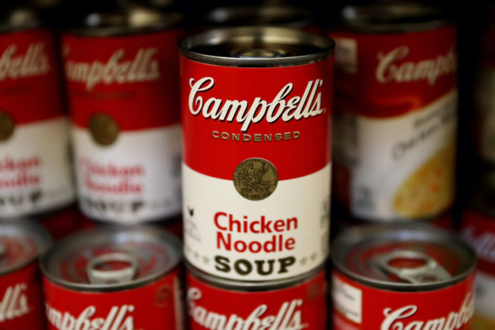
BREAKING NEWS – Camden, New Jersey – The iconic labels on the flagship product of Campbell Soup Co. are getting their first redesign in five decades.
The famed red-and-white iconography will remain, but the Campbell’s logo is receiving a “modernized logo scripture.” As part of this change, Campbell’s is eliminating the shadow and slightly changing its font, which is based on founder Joseph A. Campbell’s signature.
Other changes to the design include the word “soup” printed in a new font. Campbell’s fans can also pick out subtler elements, such as a more pronounced C in the fleurs-de-lis and a slanted O in the word “soup” — which pay tribute to the letters from the first label, made in 1898. They ignored PETA’s request of having on Chicken Noodle Soup, a group of hens standing in front of a firing party.